MUSEUM OF POP CULTURE
Website Usability Testing
Project Details
Client: Museum of Pop Culture, Seattle
Project Type: Usability Study,
User Research
My Role: UX Researcher
Tools Used: Figma
Team: Pranali Raorane, Natasha Alcantra, Luka Sherman, Harsheen Vohra, Kaitlyn Zhang
Project Timeline: June 2022- August 2022
My Responsibilities: Heuristic Evaluation, Usability Test Script, and Usability Interviews, Usability Analysis
Project Context
This project was part of the University of Washington's Design for Passion Summer Project. Our client was, The Museum of Popular Culture (MoPOP), formerly the Experience Music Project (EMP), which is a public nonprofit museum located in the Seattle Center.
Problem
The development team was planning to complete a full site redesign in the next calendar year, and looked for a usability study to highlight the website’s current strengths and areas of improvement, with a focus on ‘mobile ticketing’. Since majority of the MoPOP customers used their phones to book tickets, the team focused on the mobile experience and its usability.
Process and Timeline

Methods and Procedures
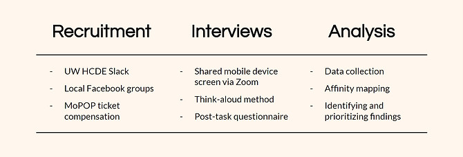
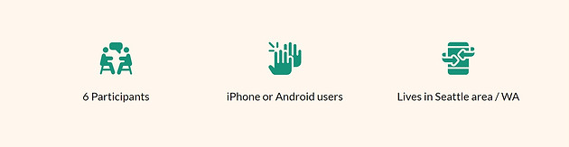
Participants
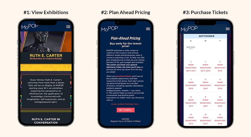
Website Research- Key Tasks
Analysis
For analyzing the data gathered from the usability tests, we used Affinity Mapping to organize the information. We formed categories of Observations, Quotes, Task Completion, and Design Suggestions. We then categorized the issues faced by users in rank of severity.

1. Exhibition Times
“I feel like an end date is kind of important. I can find the start date, but I don't know when it ends. I would probably want to know when the exhibit ends. I would have to dig deeper to find it.”

2. Menu
“I feel like there’s a lot of information. The menu is very cluttered.”
“This menu is very nested. It’s hard to tell what's the hierarchy. It’s hard to tell at first glance how to find what I’m looking for.”

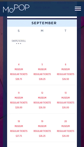
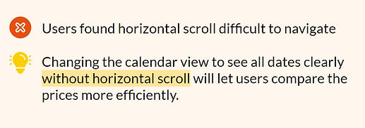
3. Calendar View
“The calendar page isn't really optimized for mobile.”
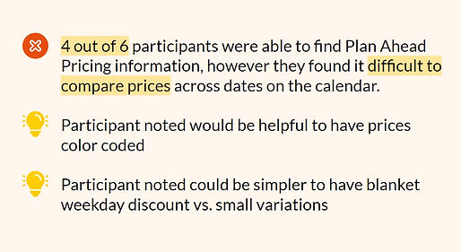
4. Plan Ahead Pricing
“As someone who wants to save as much as I can, I would probably consider the Plan Ahead Pricing and select the cheaper ticket.”
5. Ticket Selection


6. Ticket Checkout

Suggested Design Interventions
Menu Hierarchy
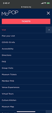
Menu hierarchy can have a clearer division of categories and sub-categories using indentation or colors.
“This menu is very nested. It’s hard to tell what's the hierarchy. It’s hard to tell at first glance how to find what I’m looking for.”
Ticketing

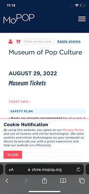

The latency issue after inputting ticket selection and before the confirmation (the “checkout”) could be resolved.
Moving the promo code to the payment page and not removing pre-existing data on entry could result in a better experience, free from frustrations.
Time entry increments could match the drop down options (and have fifteen minute interval options in the drop down)
Exhibition Dates


Highlighting and separating the Exhibition Date from the informational paragraph about the exhibition could help users notice the dates better.
Adding an ending soon tag in front of exhibitions to indicate the closeness of the end date.
“I feel like an end date is kind of important. I can find the start date, but I don't know when it ends. I would probably want to know when the exhibit ends. I would have to dig deeper to find it.”
Plan Ahead Pricing


Changing the calendar view to see all dates clearly without the horizontal scroll will let users compare the prices more efficiently.
“The calendar page isn't really optimized for mobile.”
Reflections
The usability tests conducted on the MoPOP website were instrumental in understanding users and their experience of performing important tasks. Based on the data collected, our team has come up with the plausible design interventions mentioned
Information in form of insights from the test participants, brought a few usability and design issues to light.
The next steps could be to incorporate the suggestions into the website design and run tests on prototypes.